Introducing Scribeberry's V2: Reduced Errors, Improved Detail, Template Sharing + More
Scribeberry version 2 is here with Advanced Mode, a Template Hub for sharing templates, and enhanced security with password logins. We’ve revamped the UI for a unified, user-friendly experience, plus dark mode and improved mobile functionality.

Dear fellow scribers,
Today, we're thrilled to announce the launch of version 2 for Scribeberry—a major upgrade packed with new features and a refined layout. We know it's been a minute since our last update, and we appreciate your patience. This new update is jam packed with improvements based on all your wonderful feedback – so thank you!
Here's what's new:
Advanced Mode
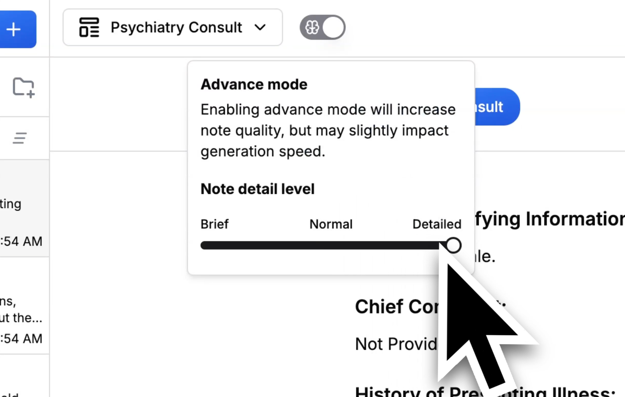
Based on invaluable feedback from psychiatrists, developmental pediatricians, geriatricians, and other specialists who require detailed documentation, we've developed an Advanced Mode. This feature empowers you to create comprehensive, multi-page consults without missing crucial details.

When Advanced Mode is activated, our proprietary algorithm significantly enhances the quality of your notes, reduces potential inaccuracies, and, if desired, substantially increases the level of detail. The trade-off is a slightly longer note generation time—approximately 8 seconds more.
Advanced Mode Options
Don't just take our word for it—see the difference below. We've provided two notes created using the exact same sample transcript for your comparison.
Case study
Template Hub + Previews
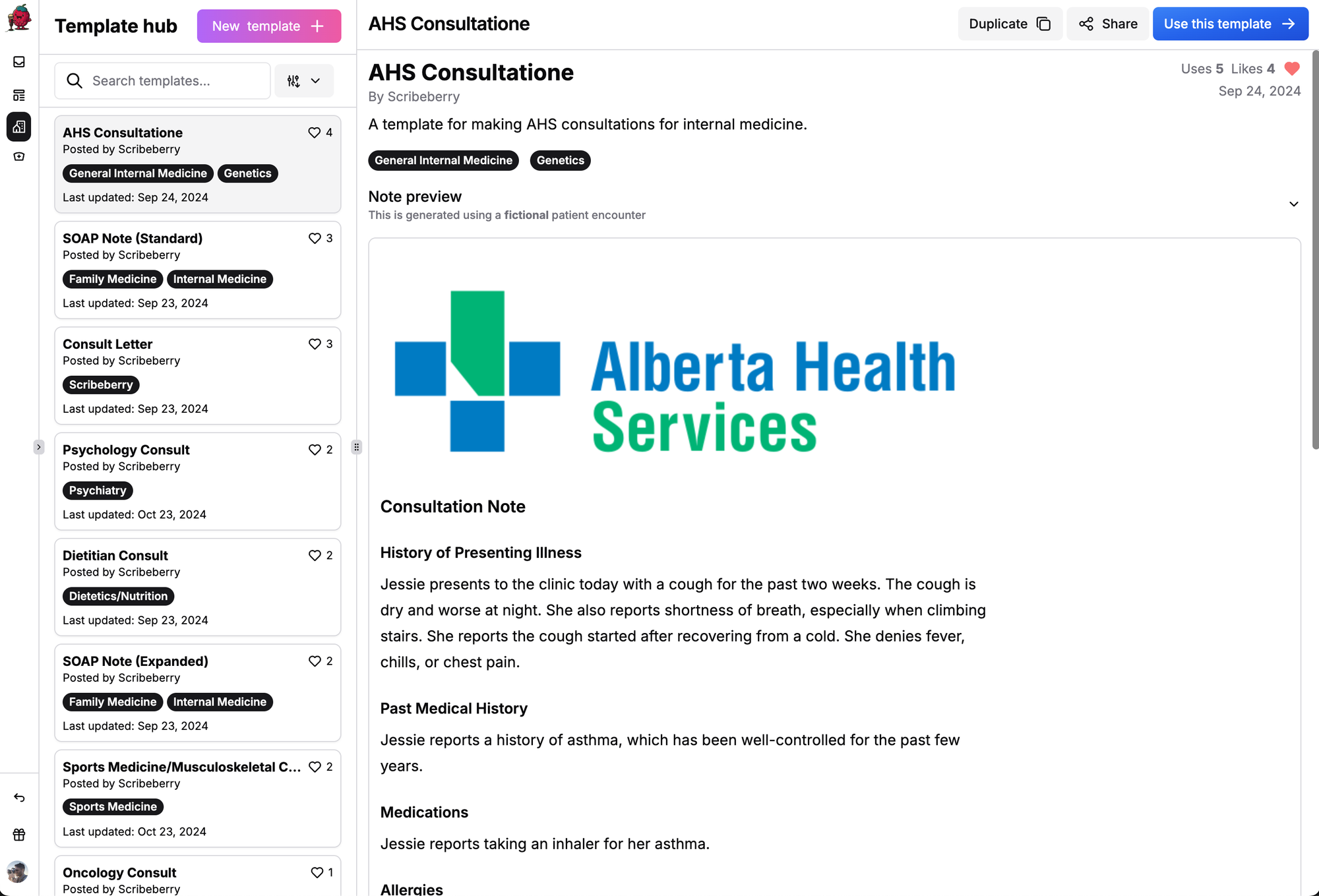
Introducing the Template Hub! You can now share your templates globally and access those shared by other users. Preview templates during creation, and feel free to duplicate and modify Scribeberry's own templates to suit your needs.

Password Logins
For added security, we've launched password logins. If you don't have a password yet, please set one up using the password reset button on the login page. You can still use Google logins if you prefer.
A Simpler, Refined UI/UX
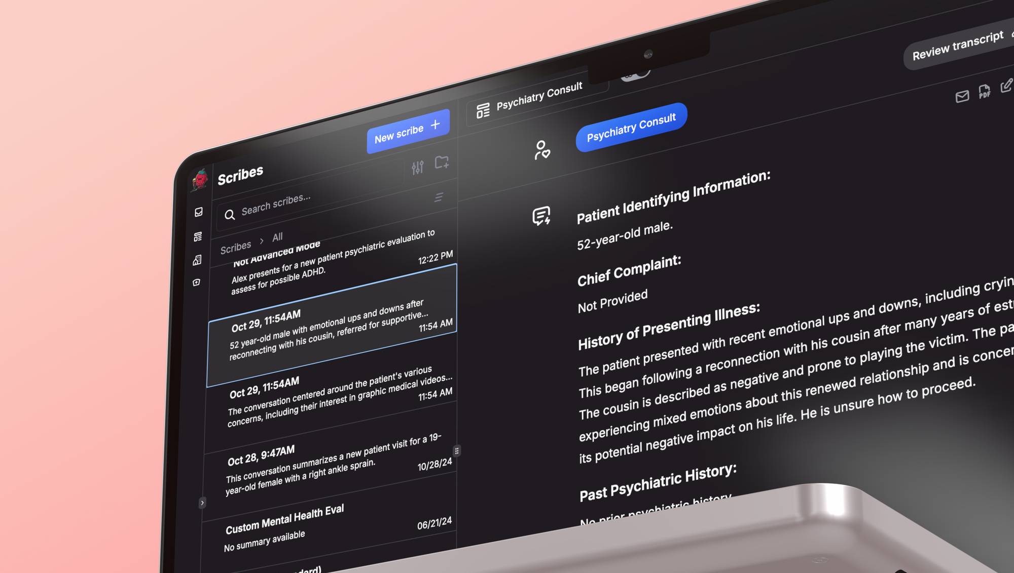
We've redesigned the user interface for a more intuitive experience. Here's a high-level summary of the changes:
- Unified Interface: No more pop-ups or modals for note input—everything is now on one screen.
- Light/Dark Mode: Switch between light and dark themes based on your preference.

- Enhanced Mobile Experience: Improved UI/UX on mobile devices for ease of use.

- Upgraded Scribe Management: Better storage, sorting, and functionality for your notes.
- Dedicated Sidebar: A new left-hand sidebar for easy access to the Template Hub and creation tools.
We hope these updates enhance your experience with Scribeberry. We have a lot more coming. As always, your feedback is invaluable to us, and we look forward to hearing your thoughts.